
Macaroni cowboy
And other lessons in design

In most institutions of scientific research, a wide diversity of scientific backgrounds makes communicating results beyond the walls of one’s own lab both a challenge and an incredible opportunity. I imagine it as a circle of understanding, at the center of which is the scientist who is an expert in their own work. Moving out from the center, successive rings of people have lower and lower comprehension of that scientists’ work. The size of the circle of understanding—and how many people it encircles—depends largely on how well the scientist at the center communicates. When the circle reaches far enough from the center, the potential for real innovation emerges. I’ve written about this here before so I won’t belabor it. But I often talk about how ideas can come from any corner of our institute, and to illustrate just how far this can go, I tested a hypothesis. On a walk with my 9-year-old, I posed a science challenge.
9-year-old: Like a test?
Me: No, not all. It’s just problem-solving.
9-year-old: Okay.
Me: There’s this type of cancer that’s in the blood, and there’s an old drug that kills the cancer cells called Mylotarg. It finds a very specific protein called CD33 on the surface of the cells, sticks to it, and basically drops bombs there, totally destroying the cancer cells. It works really really well. But, there’s a problem. Healthy cells have CD33, so it kills them too. What can be done?
9-year-old: Could they find a different thing that is only on the cancer cells?
Me: This is brilliant and yes that is exactly what people are trying to do. But this Mylotarg has already been shown to work and it is already allowed to be given to humans. It’s just really toxic. Can you think of a way we could use it more safely?
9-year-old: Well, what if they took that thing out of only the healthy cells? Then it would only kill the cancer cells.
Me: Did you know that a famous cancer doctor at Columbia University who also wrote a Pulitzer Prize-winning book about cancer had to go away on a beach vacation away from his noisy life to come up with that idea?1 And now he built a company on the idea?2 And you just did it?
9-year-old: Give me more!
I don’t mean to demean Dr. Mukherjee, who I admire profoundly, or to use this as an opportunity to brag about our son. It’s just a useful illustration of my point. If you explain something clearly, then the circle of understanding widens until a science degree or perhaps even an elementary school degree is unnecessary for someone to make a meaningful contribution to science. But not everything is as simple to explain, and that is why we pay for PowerPoint. This is where design comes in. When done well, it will expand the circle, and that’s where the magic happens.3
Good design can be anything from your favorite book cover to Temple Grandin creating a more humane way to slaughter cows to the James Webb Space Telescope. Good design often goes unnoticed—a victim of its own success. It’s the seasoned manager who doesn’t take credit when things go well but takes the blame when mistakes are made. As the designer David Craib said:
Design should never say, ‘Look at me.’ It should always say, ‘Look at this.’
Bad design is noticeable. It is the set of chipped plates in my cupboard that infuriatingly come from a design store but because the rim underneath is so far from the edge my mini-hands can’t grip it when I wash them. Bad design is the parking meters in my town that take several minutes to use.
In science, good design is an intricately precise analytical instrument, an elegantly efficient set of steps for building a molecule, a graph made out of numbers, and other abstractions. I use the tools of visual design to get information from one scientist’s brain to other scientists’ brains faster and more efficiently. This is a real, tangible way of advancing science because the more people who understand someone’s science, the better the chance it will make an impact. Gregor Mendel, who we now know as the father of genetics, died in obscurity because he struggled to communicate the results of his pea breeding experiments. He simply went back to farming and it would take decades after his death for someone to rediscover his work and move the field forward.
Design could have helped Mendel, but as much as it can aid understanding, it can also hinder it if wielded carelessly. By way of example, I met a friend for a drink at a wine bar. As we were excitedly catching up, a server handed us drink menus (Figure 1). I went straight for the reds, poised to choose something quickly without breaking stride in conversation, but I became confused when I saw red wines with names like macaroni cowboy and fate’s funny frolic.
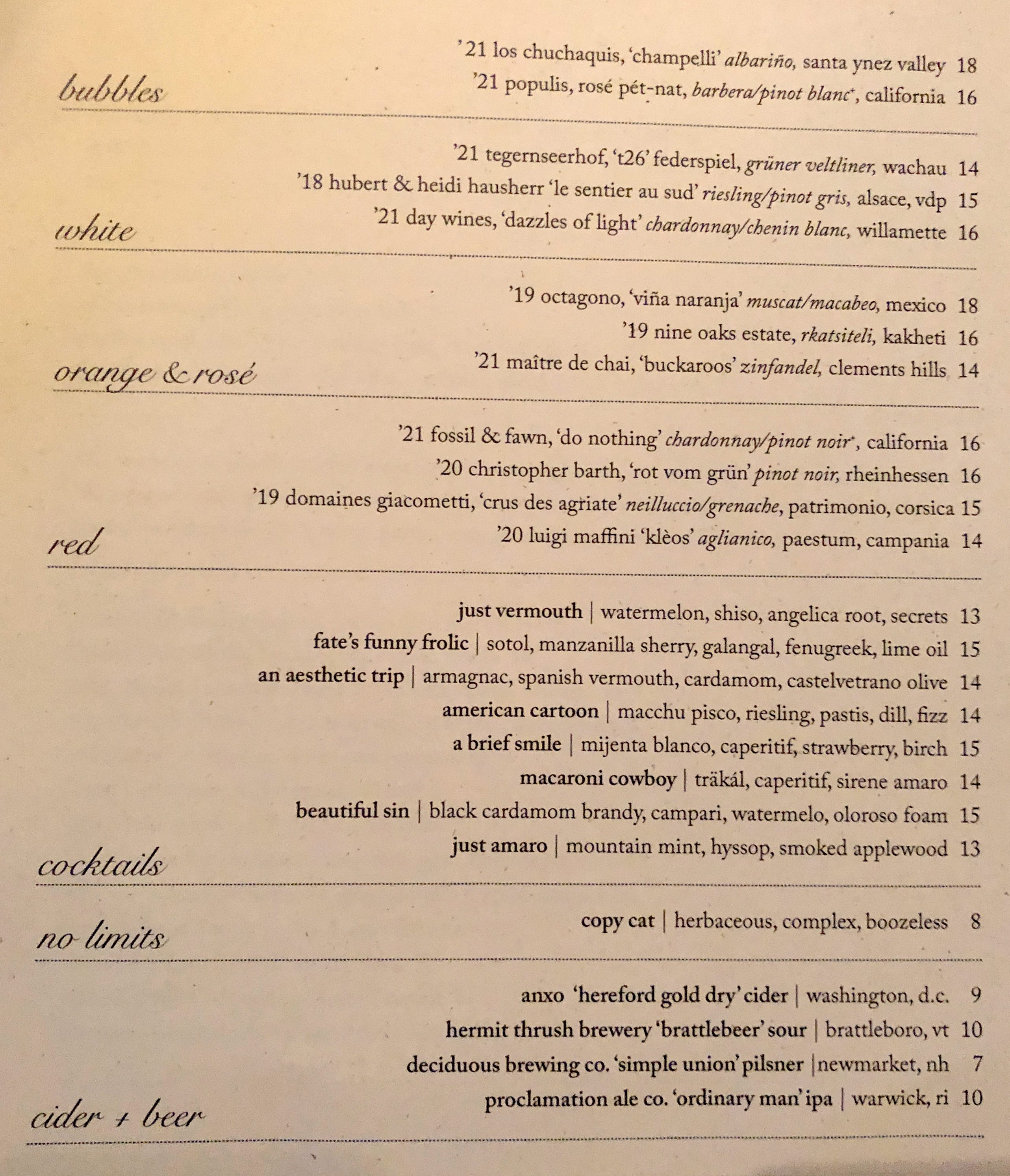
Upon closer inspection, the ingredients told me I was in the wrong section. I expected the reds to be underneath the heading “red”, but a design choice had put the section heading at the bottom of the section instead of the top. If I’d started at the top of the menu I would have gotten it, but—now touching on a branch of design known as user experience—they failed to anticipate that people might not start from the top, but rather go straight to their preferred section. The stakes were not high here. Just a temporarily thwarted conversation. But if it was communicating science on a presentation slide, it might have lost a chunk of its audience to confusion. For people like me whose minds wander easily, a mismatch in expectation like this can send their attention elsewhere, only to find themselves trying to catch up minutes later when it might be too late. An insightful question or comment might bashfully hide behind the daydreamer’s uncertainty about whether their thought was already addressed or made moot in their temporary absence. Another consequence of this confusion is that the audience may no longer feel they are in good hands.4
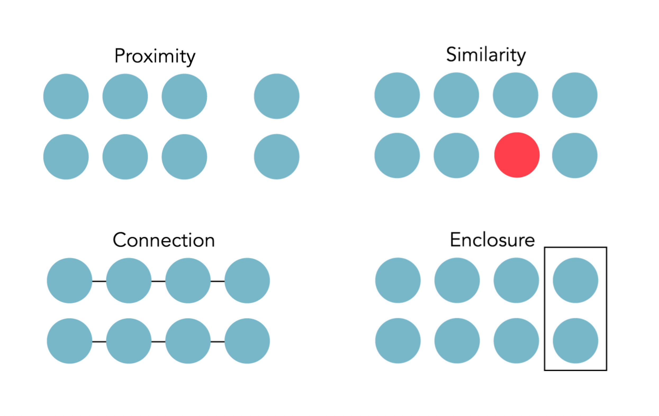
Luckily, there is science behind the ability of design to improve communication, including an understanding of preattentive-processing, cognitive load theory, and the Gestalt principles of grouping. No drawing skills needed. As it turns out, there is an easy design fix that would have saved my conversation at the wine bar and prevented me from publicly using their menu as a don’t. It comes from the Gestalt principles of grouping, which draw on an aspect of human perception that leads us to group objects together if they share, among other things, close proximity relative to other objects, similar shape and/or color, connections, and/or enclosures (Figure 2). There are more, but rather than list them all, I’ll just point out that this menu could be saved by considering the first one: proximity. If there was just a bit of space underneath each heading line, the header would be perceived as grouped with the text above it rather than below it, and I could have focused on listening to my friend telling me about her new job.5
Inattention to design principles can sabotage communications. Instead, let’s use them to our advantage.6 Consider the possibility that true innovation may come from the farthest reaches of the circle of understanding, and maybe from someone you least expect.
Thanks to Luke Timmerman’s excellent podcast “The Long Run with Luke Timmerman” for this anecdote in particular but also for bringing this entire story to my attention.
At least one reader of this newsletter will note that the real challenges are turning those ideas into medicines—developing the therapeutic modality, dodging the “valley of death” where the overwhelming majority of drug candidates fail—and he won’t be wrong. But good ideas aren’t only the sparks of projects. They can also fan languishing flames and—in the case of Mylotarg—resuscitate smoldering embers.
This notion comes from a study at the University of Washington by a team of scientists and graphic designers who redesigned graphical abstracts (visual summaries of research papers in scientific journals) from a nanotechnology journal. Fifty nanotechnology researchers were shown ten graphical abstracts, not knowing if they were original or redesigned, and asked to score the papers they represented without reading them. Papers corresponding to redesigned graphical abstracts were consistently and significantly anticipated to be more interesting, written more clearly, more scientifically rigorous, and authored by more intelligent people. From: Proving the value of visual design in science communication. Cheng, et al. 2017, Information Design Journal 23(1), 80-95
If you’re interested in seeing this principle at work in a scientific figure you can see a case study I wrote here.
There are loads of great resources out there for using design in scientific communications. The first stop should be the Nature Methods series “Points of View” by Bang Wong and other co-authors. Then check out books by Edward Tufte, Jen Christiansen, and Nancy Duarte. Another good resource is the online short course S.P.A.R.K. | 5 strategies for the visual communication of science by science illustrators Tami Tolpa and Betsy Palay. And I have a short guide called Five Simple Design Principles for a Grant Proposal Figure Makeover that really apply to any scientific figure.