

When NASA’s Mars Rover Curiosity was launched into space in 2012, destined for one specific planet in the cosmos, more than 3 million people watched online. Over a thousand others congregated in New York City’s Times Square to experience the live broadcast together. But when biochemists at MIT sent an engineered protein machine into the inner chambers of a human cell to a specific location in the vastness of the human genome, no one was pressing their noses against the lab windows. This is understandable, given that proteins are smaller than the wavelength of light, so there literally was nothing to see there. This is where science illustrators come in, making the invisible visible. Science communication depends on this, and journal cover art does it beautifully, but cover art has little to do with communication—something it took me years to figure out.
Because of my background in science, I prided myself on creating candidate cover art that captured the perfect metaphor, or zeroed in on the heart of the finding. Surely my understanding of the paper would put me ahead of the pack. But I kept failing. Other images were being chosen for cover after cover. My success rate was about 50%. Granted, nearly every rejection was from Nature, Science, or Cell journals, which are notoriously competitive unless you’re Ella Maruschenko. Nevertheless, I began to see the limitations of not having been formally trained in art. But the real problem was that I had a fundamental misunderstanding of the role of cover art. The purpose of cover art is not to tell a story or really to explain anything at all. My efforts should have been focused on one thing—making it beautiful. I don’t say all this to offer the secret for getting cover art. This series is about exploring the role of art in science. And the role of cover art is to draw readers in with its beauty, sparking their curiosity so they will feel compelled to read the paper.
Since the time that I made these images, I’ve stopped taking cover art projects for all but a handful of special occasions, instead responding to most requests with a list of other professionals. My heart is in communication, so I stopped fighting it. Both endeavors are meant to spark curiosity, but while cover art is meant to draw the reader into the article, the figures within the articles are meant to draw the reader to the next experiment. The better (read: clearer) the figure, the more chances for lightbulbs to go on above heads. These are the sparks of curiosity I hope to ignite.
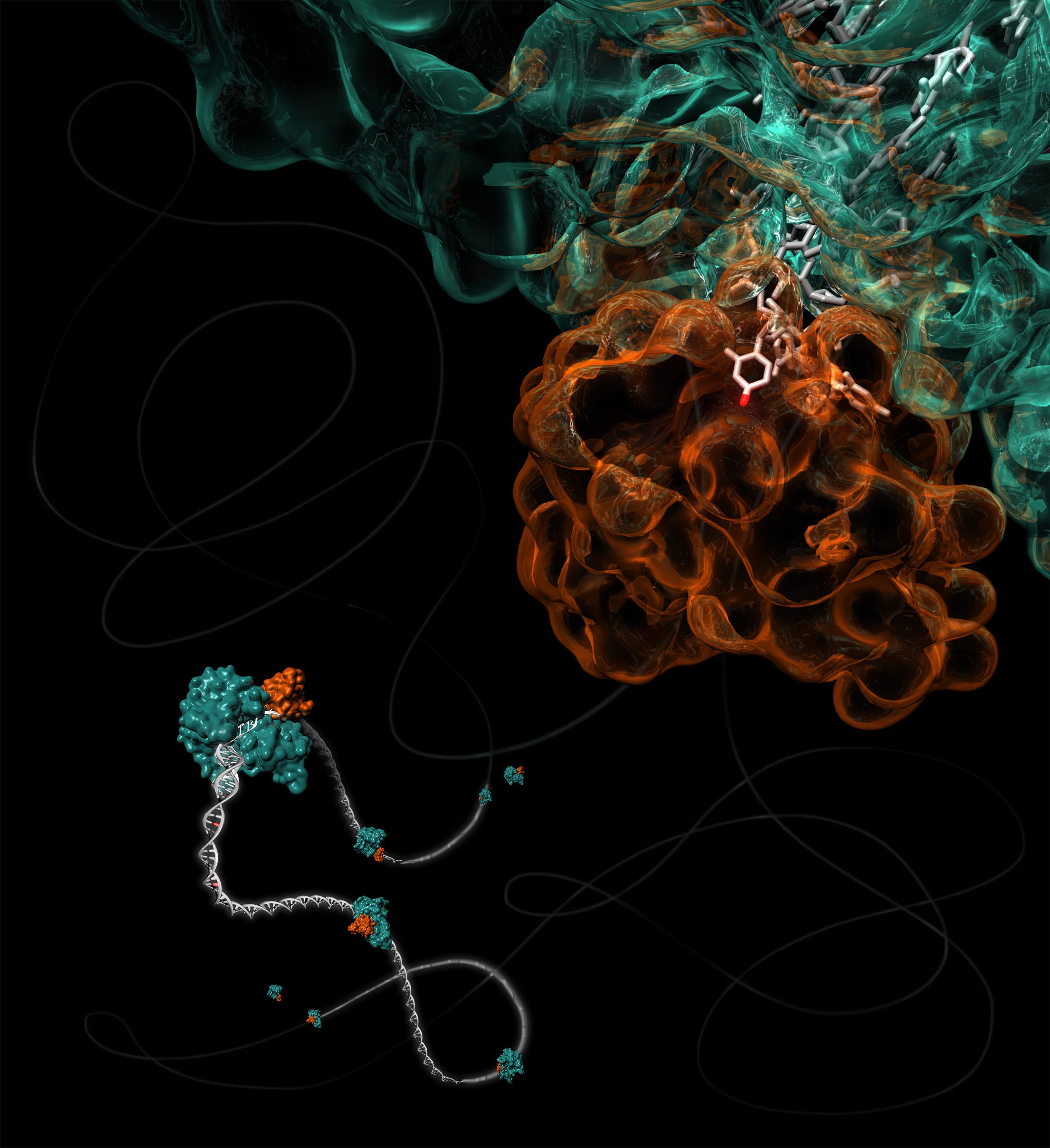
I prepared both of the illustrations shown here as cover art candidates for The Journal of the American Chemical Society. The image above depicts a DNA rover on its own mission to create genetic mutations across the rugged genomic landscape. This molecular rover was built by attaching a protein that creates mutations (a mutagen) to a protein that travels along DNA like a zipper, reading it and translating the code into RNA. The mutagen gets a piggyback ride on the RNA polymerase as it zips along the DNA, allowing it to mutate DNA bases on its path.
The white tubes in the image are the DNA. The orange glass sculpture is the mutagen, holding nearly every atom of DNA that it touches in precisely the right position and orientation to do chemistry on it. This perfect positioning enables a nitrogen-containing amine group on the DNA base cytosine (C) to be swapped for the oxygen-containing carboxyl group (the one protruding like Rudolph the Reindeer’s nose in the image above). With this little sleight of hand, the C is converted into a base called uracil (U), which is found in RNA. But when the DNA gets copied, the Us will be corrected to Ts, leaving that spot with a permanent mutation from C to T. See? I can’t stop trying to turn it into a communication.
Since then I also became more interested in writing, and in finding the right combination of words and pictures to most effectively communicate. When I wrote about this engineered protein rover for the first time in 2018 after the paper came out, I likened it to teenagers who hang out of car windows with baseball bats to smash mailboxes while driving down the street. There are two problems with this analogy. The first is that disclosing knowledge of this activity even second-hand surely reveals the lower limit of my age. I don’t think anyone has smashed mailboxes with bats since video games were invented. The second is that it suggests that the mutagen damages the DNA, which isn’t true. It just changes it to a different DNA base, and hopefully for the betterment of the neighborhood, or the protein it encodes.
By using this mailbox analogy, I’d buried the lede, and here is the part that I should have focused on. This little contraption—the RNA polymerase/mutagen chimera—does in milliseconds what it might take evolution billions of years to do. Normally mutations happen sporadically, accidentally. Sometimes they are harmful and sometimes they are advantageous. Sometimes they are both, like a specific mutation in hemoglobin—a protein that carries oxygen around in the blood. Inheriting one copy of the mutation from just one parent is protective against malaria, but having two copies of the mutation leads to sickle cell disease.
The study highlighted here was a proof-of-concept carried out by the Shoulders Lab at MIT that showed they could speed up the process of evolution in just one specific gene. They could try to create a better version of a protein in days rather than generations. It wasn’t ever meant to create better people or designer babies. But it could improve the efficiency of an enzyme that breaks down plastic waste, or the efficacy of a protein that acts as a medicine, like a cancer treatment. In the same year that this paper came out, Francis Arnold was awarded a Nobel Prize in Chemistry for her pioneering work in this area dating back to the early 1990s.
The winning image for this issue ended up being the other option I submitted (below). I suspect it was chosen because it harkens back to a famous synesthetic artist from the Bauhaus era. It simply looks like a piece of art.

Loved this, Mary! So many layers to art and communication, and especially so for science art and communication. I’m so happy that you continue to contribute to this wonderful and oh-so-challenging endeavor with both words and images (I loved the baseball bat part and it never dawned on me that teens don’t go driving around in convertibles any more…).