
Can AI do science illustration?
Let's see.

It’s hard to describe the complicated mixture of dread and anticipation I felt while watching AI programs try to illustrate a paper I published 14 years ago. On the one hand, if it worked, what would that mean for science illustrators? On the other, what if excellent science communication was truly at everyone’s fingertips? What could it mean for the moment in time that science has found itself in?
In July of 2006, at the peak of the housing bubble that would soon cause a global financial crisis, massive hiring freezes in science, and what Ethan Perlstein would coin the postdocalypse, my postdoc advisor mentioned that it would be nice to have a picture. We were working on bifunctional chemical compounds that would bind to an IgM antibody with one end, and the sugar-binding B-cell-surface receptor, CD22, with the other end. Like molecular velcro, it was a way to deliver toxins to B cells for the treatment of B-cell lymphoma. Using Photoshop and the trackpad on my Macbook, I drew the picture below.
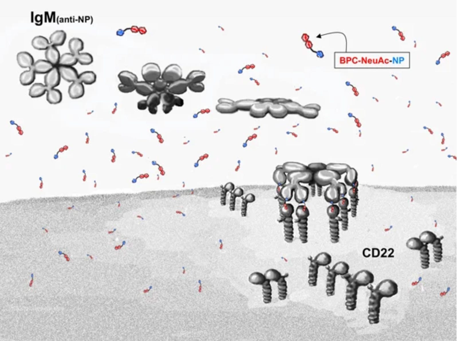
While I drew it, I kept stopping to consider things like the relative concentrations of everything and how the receptors might cluster since they have sugars on themselves that also make them bind to each other. This is what science illustrators do. I also went to the primary literature to find evidence that the IgM antibody arms bend down like hinges to engage their antigens, as shown, as opposed to the way we had been crudely depicting it, like an arcade claw machine. Though I would go on to make cleaner, clearer variations using vector graphics in Adobe Illustrator once I learned how to use it, my advisor refused to replace this original one in his talks.
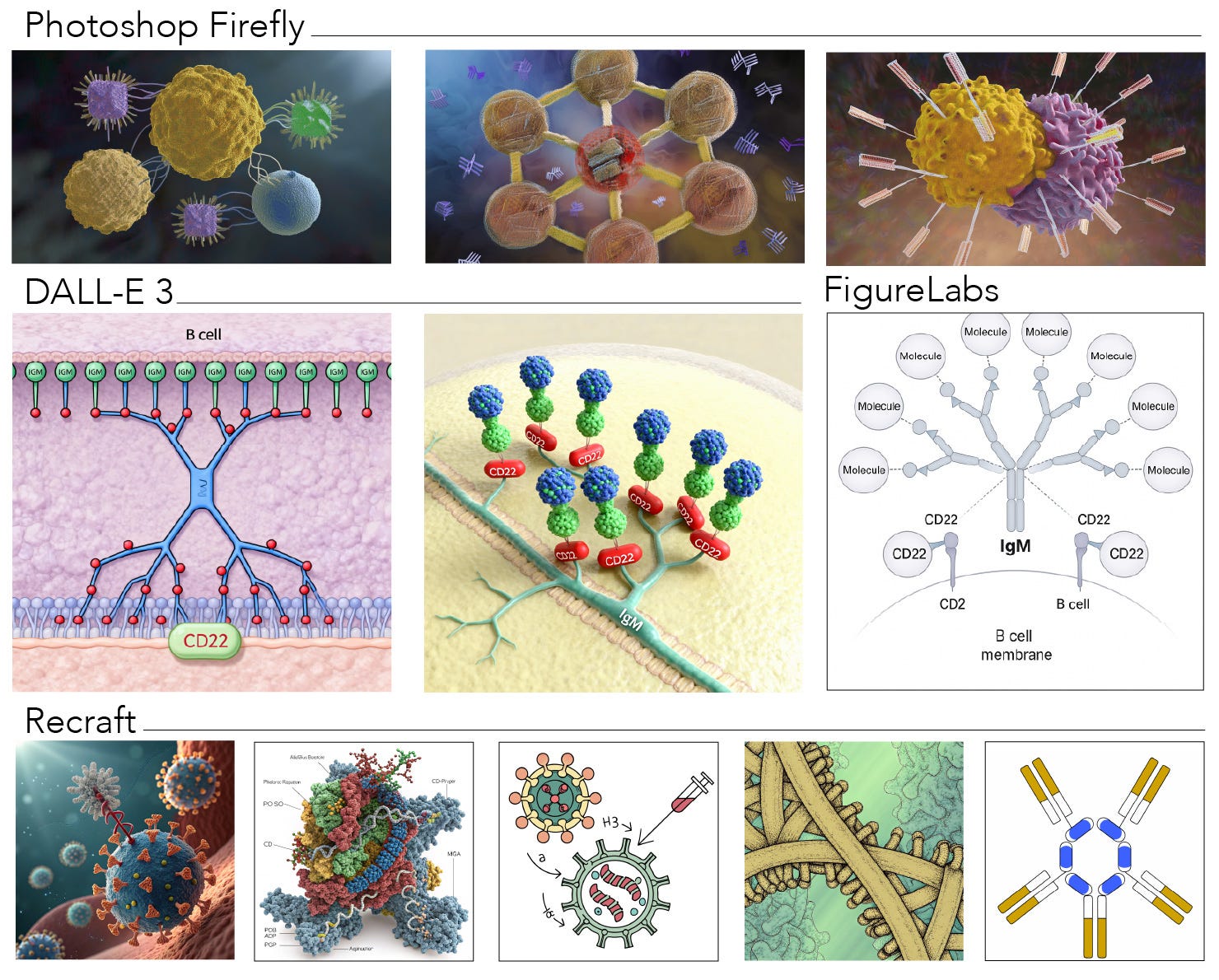
I wondered if I could create the same complex using AI. I started with Adobe Photoshop’s Firefly AI image generator because it seems to have the best ethical rating in terms of paying artists for the art it was trained on. I gave it this prompt:
10 copies of a molecule, each interacting simultaneously with one of the ten epitope-binding sites of a single IgM antibody and one copy of CD22 on the surface of B cells.
It returned the 3 images in the top row below, which were… not that. Ok, how about DALLE-3, which some consider the gold standard for image generation (middle row, left and center)? Interesting, but still no. I searched for AI programs for science graphics and came across FigureLabs and Recraft. FigureLabs (middle row, far right) started to get there, but didn’t even use the number of molecules I asked for, or the right IgM, nor did they make the complex I described. Recraft, well, you can see (bottom row).
So, none of these recapitulated the complex. This was a complicated prompt for sure, but science is complicated. I needed to know if it was up to the task.
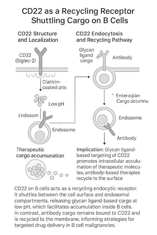
I went over to Google Gemini, where I could upload a paper I published from this work1, and see if it could create an illustrated summary of the key findings. Maybe it would do better with more context. I started by just asking for a summary of the paper, which I could use to prompt the image.
It returned this summary:
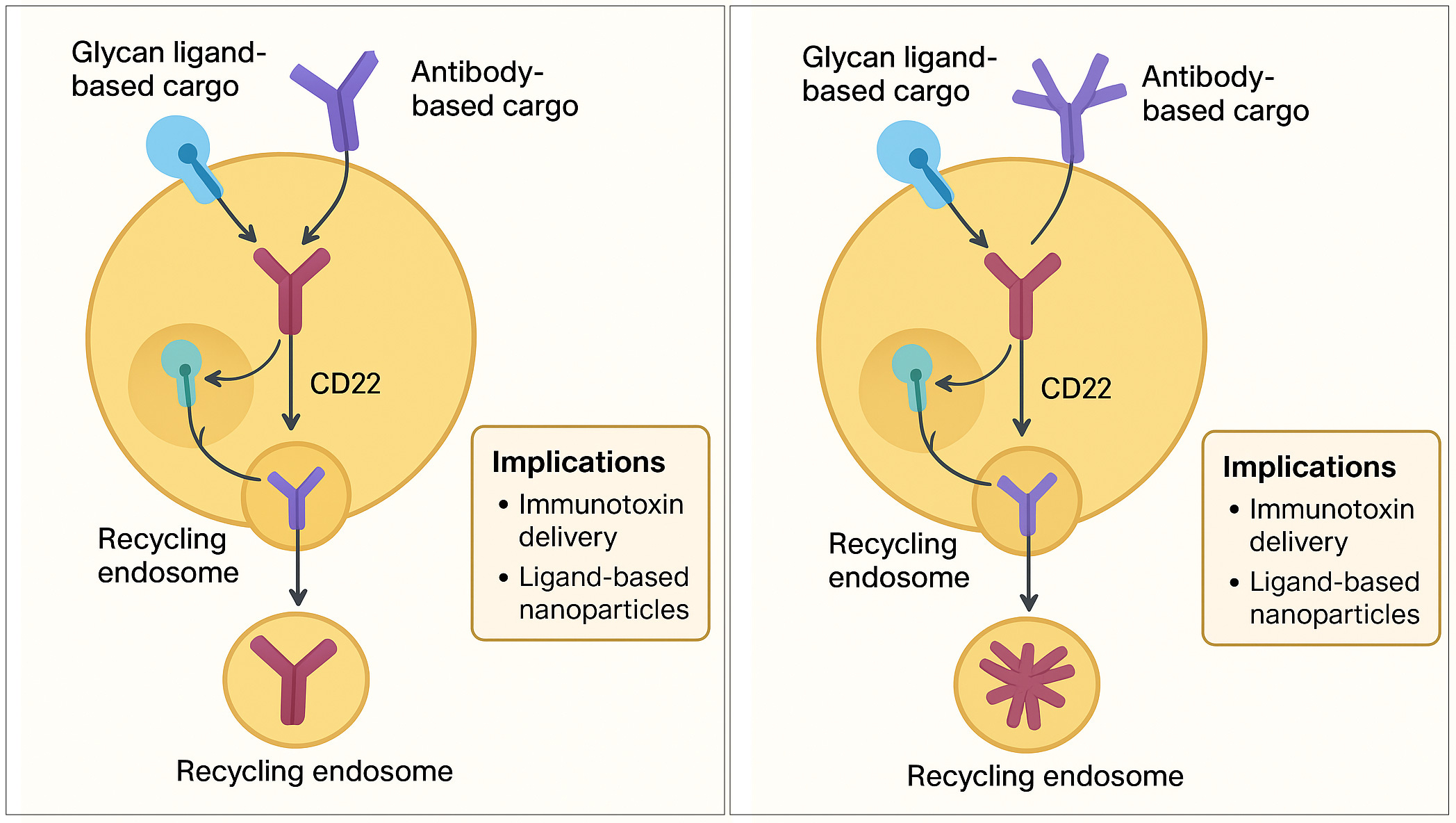
Key Findings
CD22 is a Recycling Receptor: Contrary to the prior belief that CD22 is degraded after internalization, the study demonstrates that CD22 is constitutively recycled back to the cell surface of B cells.
Differential Cargo Fate: The fate of the cargo depends on what is bound to CD22:
Glycan Ligand-Based Cargo: This cargo is released from CD22 in the endosomes due to the low pH, and subsequently accumulates intracellularly as the CD22 receptor continues to cycle. This accumulation happens because the glycan ligand binding to CD22 is attenuated at pH 6 and largely abolished at pH 5.
Anti-CD22 Antibodies (aCD22): Antibodies, which do not release from CD22 at low pH, remain bound to CD22 and recycle with the receptor back to the cell surface, thus failing to accumulate inside the cell.
Implications for Therapy: The results suggest that the efficacy of B cell-targeting agents, especially for delivering cytotoxic cargo (immunotoxins), may be facilitated by using pH-sensitive glycan ligands rather than antibodies, as this mechanism allows the therapeutic payload to be released and accumulated inside the cell.
Me: Great summary! Can you now create an image that summarizes this text?
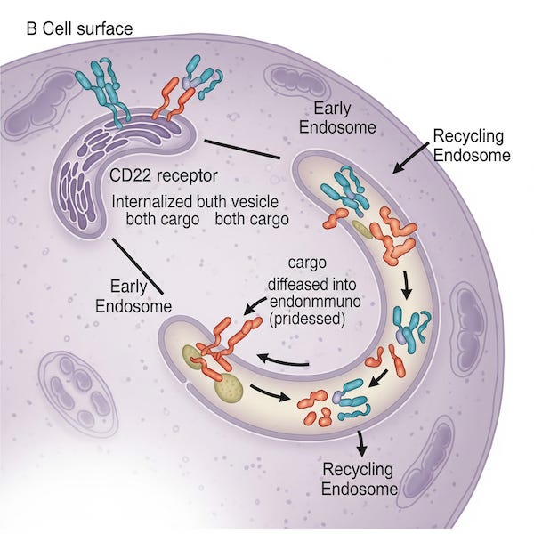
Oof. Setting aside for a minute the fact that somehow the endoplasmic reticulum and golgi apparatus (which are not part of this process) seem to have been miniaturized and confined to an endosomal compartment for no apparent reason, there is nothing on the surface of the cell. The whole point is that CD22 shuttles cargo from the outside in, then goes back out for more.
So I tried the latest version of ChatGPT. It returned the image on the left below. It wasn’t even close, so I just chose one issue to attempt to correct, playing the part of a client trying to coax a better result.
Me: Can you try again, but in addition to the purple antibody, make another one with five copies of the antibody in a radially symmetric arrangement with the Fab arms facing outward (IgM)?
Nope, and nope.
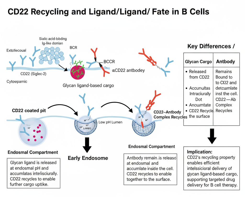
Recraft doesn’t support uploading a paper, so I just used the summary above with a little extra direction.
Me: Using the summary below, create an image that shows CD22 receptors on a B cell surface internalizing both an IgG antibody and an IgM antibody. The IgG stays bound to CD22 and comes back out to the surface when CD22 recycles. In contrast, the IgM antibody gets dropped off inside the cell, so CD22 comes back out empty and binds more. Here are more details. [“Key Findings” above]

I’m not sure where to begin with this one. Now there seem to be viruses involved and a bridge to nowhere.
Moving on. I tried FigureLabs.
This seemed to be headed in a better direction, except that the receptor CD22 looked like an antibody, and then, somehow, it was an antibody, and the cargo got into the cell on its own, or possibly the CD22 turned into the cargo. I decided to let it try again.
I tried to suggest changes to this one, but I had already used up my free prompts. Anyway, maybe this will improve, and there is obviously reason to believe it will. But even if it eventually solves the problem of illustrating a 14-year-old result, how will it ever be able to depict truly new discoveries that it couldn’t have been trained on? And also why would scientists want to put their brand new discoveries out there to be trained on and possibly discovered by someone else?
I know, I know, prompts matter, so I tried one last thing.
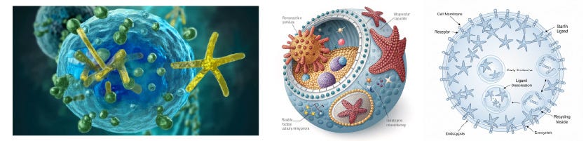
Me: Create a scientific diagram of a cross-section of a spherical cell. Receptors on the cell surface bind to a starfish, where each starfish leg binds to two copies of the receptor. The receptor looks like a stack of small spheres in a rod-like shape. Show some of the receptor-starfish complexes being swallowed by the cell into circular vesicles. Inside the vesicles, the starfish are released, and then show another vesicle with empty receptors returning to the surface to pick up more starfish.
Photoshop, Recraft, and Gemini, respectively:
So, human science illustrators are needed, and maybe more than ever. But government-funded scientists are in a really tough spot now. Threats to funding mean they might not be able to afford to hire a professional for their graphics, but, paradoxically, because there might be higher competition for a smaller pot of money, they can’t afford not to take communication seriously.
Obviously, I am biased, but I feel strongly that scientists ought to know about people like recent Duke grad Sophia Kuhn, who majored in Chemistry and is now looking for opportunities to share her talents in science illustration, with a passion and maturity that belies her age. And Ella Watkins-Dulaney, a recent Ph.D. from Nobel laureate Francis Arnold’s lab at Caltech, who offers a diverse range of science communication skills, knowing that adaptability is everything in the face of an uncertain future. She and Emma Erickson, who has a Ph.D. in cell and molecular biology from UT Austin, have day jobs in publishing capacities that allow them to use their skills, but they also take freelance work. There are science illustrators who haven’t left the bench, like pharmacology Ph.D. Behnoush Hajian, who taught herself 3D modeling skills that complement her keen sense of design and composition, forged from a lifelong photography practice. Gloria Fuentes spent decades in biomedical research until her growing concern about funding for science gave her an epiphany about the crucial role of communication, leading her to science illustration. She clued me in when Claude and BioRender had partnered up2. Some illustrators run full-blown studios like scicomm veteran Nicolle Rager Fuller, who was generous enough to get on the phone with me when I first began considering this as a career, and 3D artist and animation whiz Mao Miyamoto, who I had a lovely chat with over hot chocolate at L.A. Burdick’s in Harvard Square when she was just starting out.
You would be in good hands with any of these artists, but even if you’re not in the market, enjoy their portfolios!
CD22 is a recycling receptor that can shuttle cargo between the cell surface and endosomal compartments of B cells. O’Reilly MK, Tian H, Paulson JC. J Immunol. 2011, 186(3), 1554-63.
If I was going to be nervous about anything it would have been for BioRender, a great resource for creating science graphics with over 40K drag-and-drop science icons. It’s a fantastic tool and supplement but it doesn’t replace illustrators either. I paid $20 to try out their collaboration with Claude but all it does is return a list of instructions and suggested icons for creating the figure yourself in BioRender.